Account Analytics on Solscan
Account Analytics provides a comprehensive view of a wallet’s on-chain activity and balance patterns over time. Designed for users who want to go beyond raw transaction data, it offers an intuitive way to visualize transfer behavior, balance trends, and activity frequency.
Account Analytics includes two sub-tabs: Overview and Transfer Heatmap.
How to Access
The Account Analytics tab is available on every Account page on Solscan.
To access it:
- Navigate to the wallet’s Account page.
- Open the Analytics tab.
- Choose between Overview or Transfer Heatmap to explore specific insights.
Users can hover over data points for precise values, toggle legends to show or hide data sets, and analyze patterns directly within the platform.
Overview Tab
The Overview tab summarizes key metrics and balance data of a wallet, offering both a snapshot and trend-based insights into its recent activity.
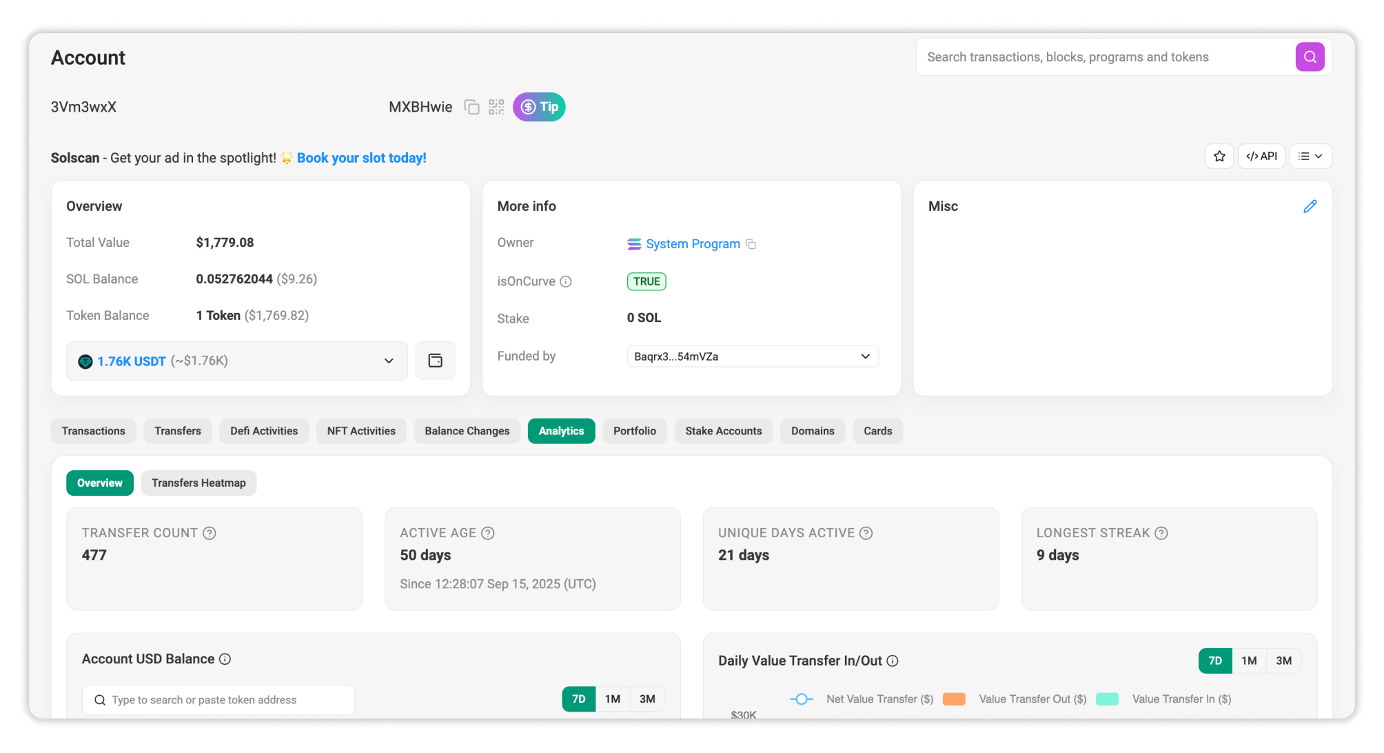
Wallet Metrics
- Transfer Count: The total number of transfers involving the address as a sender or receiver.
- Active Age: The number of days since the wallet’s first funding transaction.
- Unique Days Active: The number of days the wallet has recorded on-chain activity.
- Longest Streak: The longest consecutive streak of days with on-chain activity.
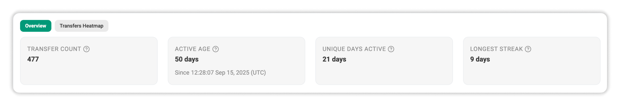
Analytics Charts
- Account USD Balance: This chart displays the wallet’s daily balance in USD over the time period. You can also view a specific token’s balance by pasting its token address in the header bar.
- Daily Value Transfer In/Out: This chart visualizes total daily value transferred in and out of the wallet.
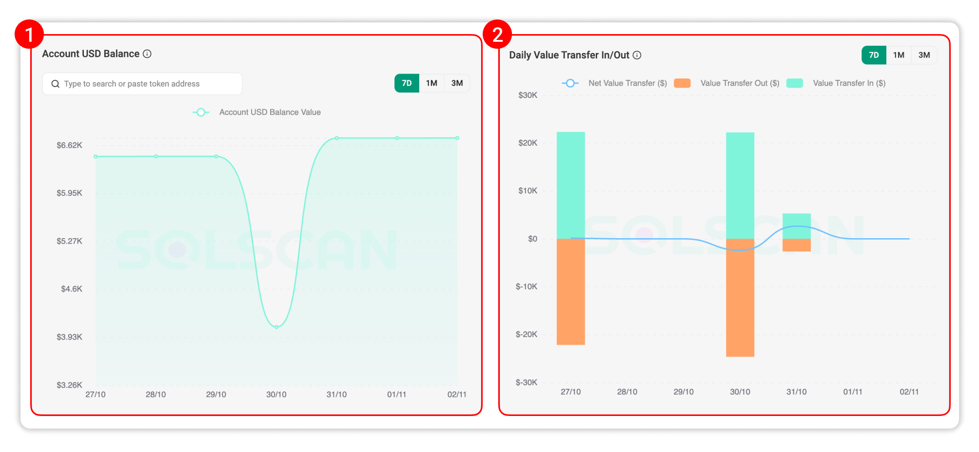
- Top Inflow/Outflow: These tables list the top addresses the wallet has interacted with, ranked by the highest transfer value that the wallet has received from (inflow) or sent to (outflow).
Data Coverage
All analytics charts can be viewed over a selectable time range of 7 days, 1 month, or 3 months.
By default, the charts display the most recent 7 days of data, but users can expand this range as needed by selecting the legend to review longer-term patterns.
All data visualizations are generated from indexed on-chain records and refreshed periodically to ensure the charts reflect recent wallet activity.
Transfer Heatmap Tab
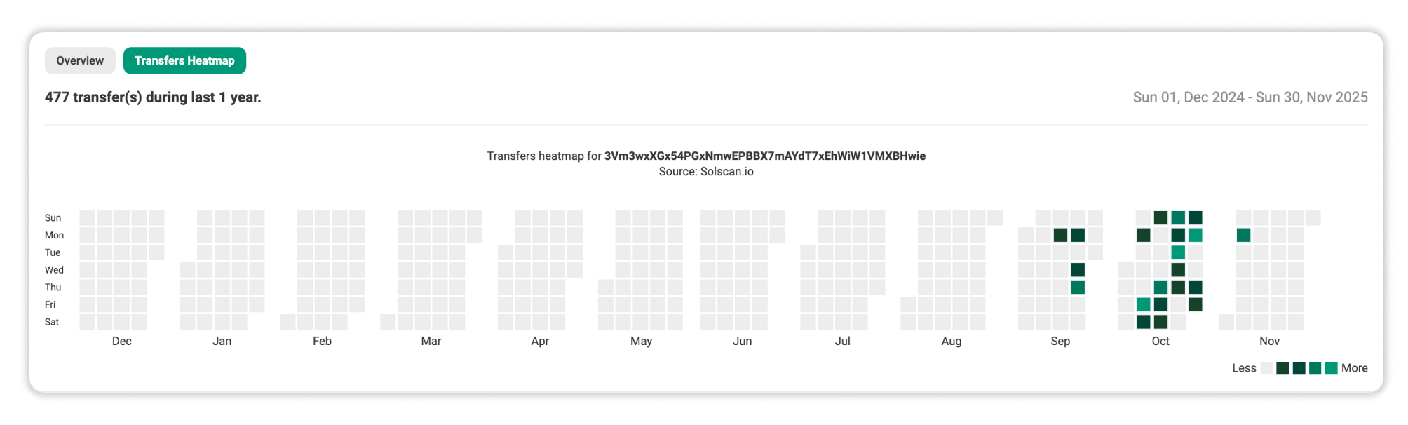
The Transfer Heatmap offers a calendar-style view of your wallet’s transfer activity across each month, inspired by the GitHub contributions chart.
Each square represents a day, with color intensity corresponding to the number of transfers made. Hover over any date to see the exact count of transfer events, or click View Details on a specific day to filter transfers for that date.
This visualization helps identify consistent activity periods, highlight peak transaction days, and spot inactive periods at a glance.