Token Flow Visualizer
Understanding how tokens move between wallets is essential for analyzing holder behavior, tracing on-chain patterns, and detecting early signals of accumulation or distribution. To support deeper insight into these flows, Solscan is introducing a new feature: the Token Flow Visualizer - a new interactive graph tool helps users explore token movement among top holders through a dynamic node-based interface.
How to Access
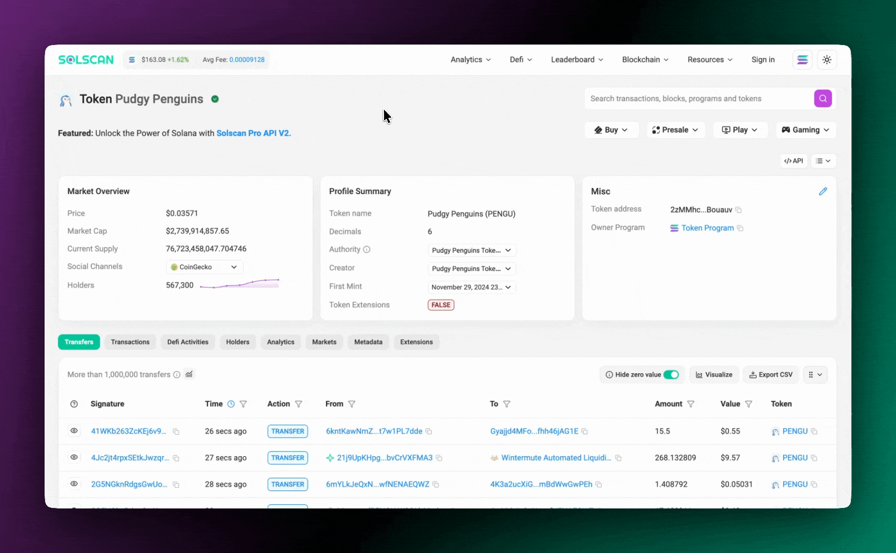
Getting started is simple. Navigate to any token page on Solscan and open the Holders tab. At the top right, you’ll find the Visualizer button. Click to launch the graph and begin exploring token movements in real time.
Note: The visualized data is for demonstration purposes and should always be interpreted alongside your own due diligence.
Visual Approach to Holder Analysis
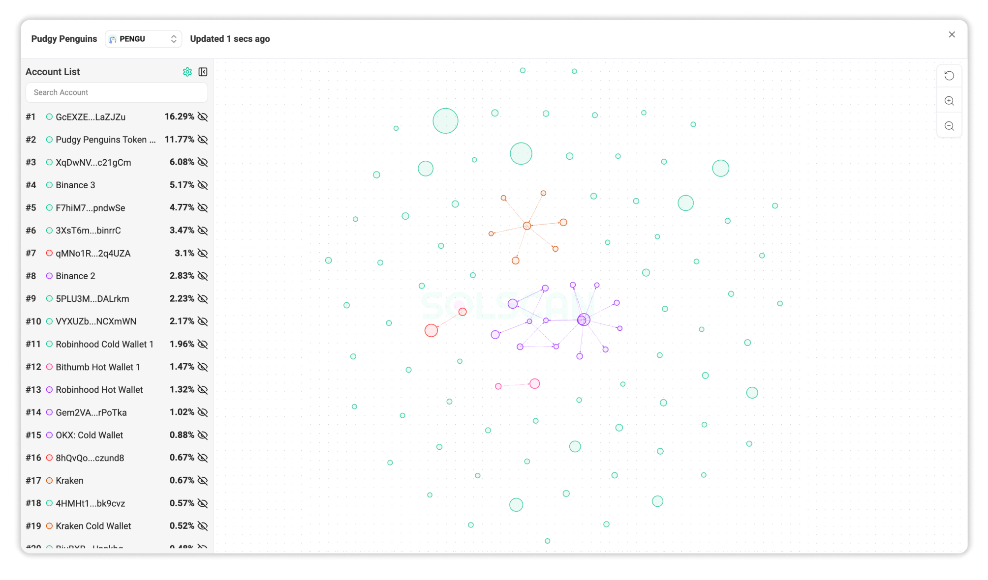
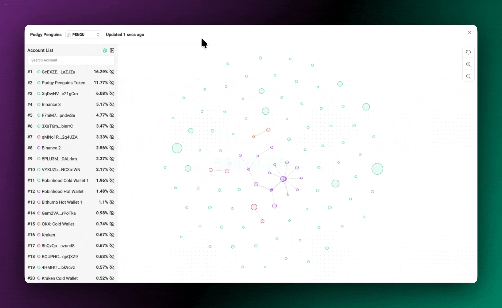
Traditional token holder lists provide a static view of who owns what. The Token Flow Visualizer takes it further by mapping out how tokens move between wallets, revealing the relationships and transfer patterns between major holders.
Each wallet is displayed as a node, while token movements are represented by directional arrows between them. The size of each node will be correlated with the amount the wallet is holding.
This format allows users to visually interpret clusters of wallet activity, identify major sources or sinks of token flows, and investigate potential coordination between addresses.
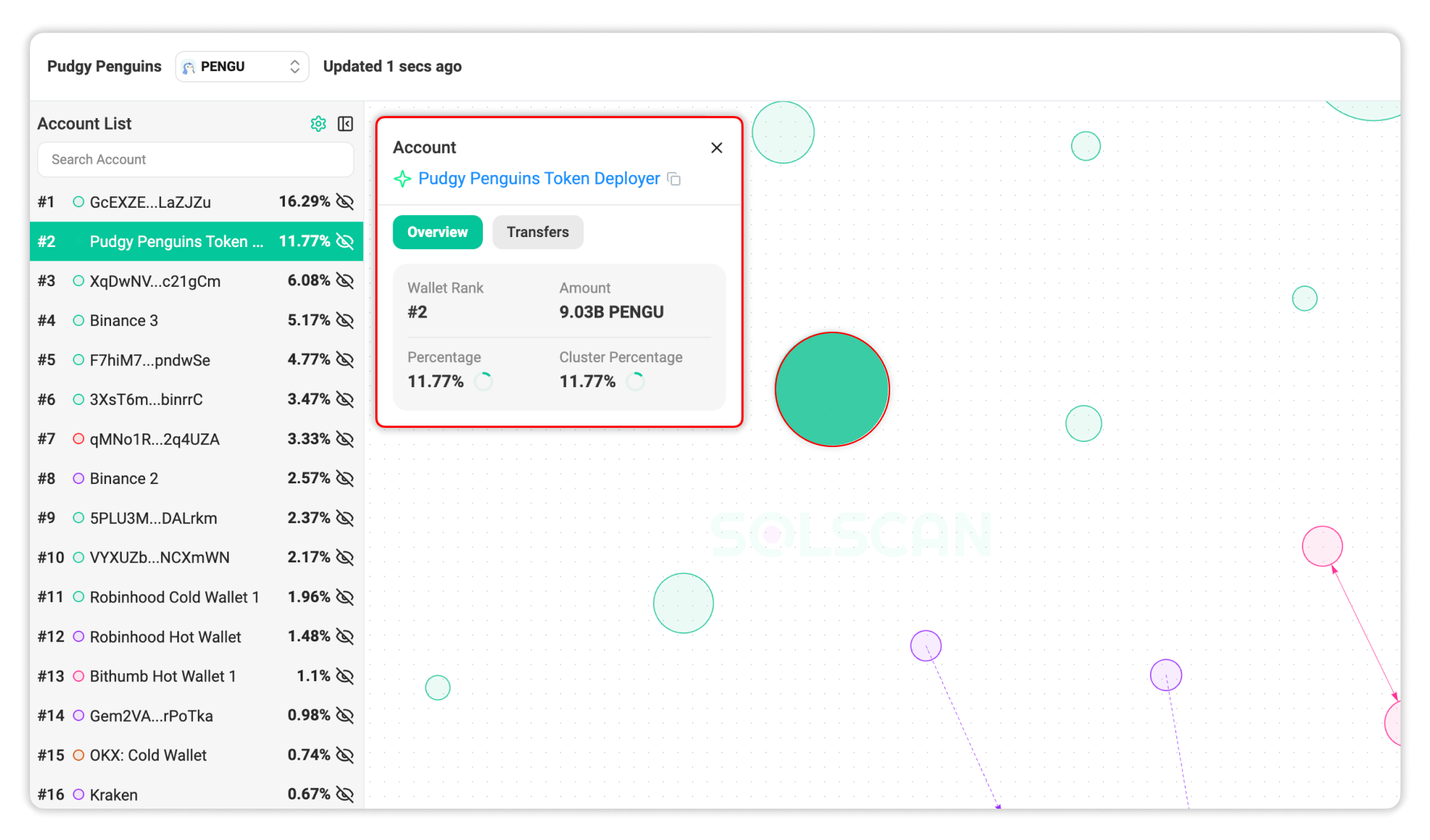
Node Details
Clicking on a node reveals additional information about the wallet, including:
- The address and its public label (if available).
- Its wallet ranking among the top holders.
- Current token balance and holdings percentage.
- Transfers history relevant to the selected token.
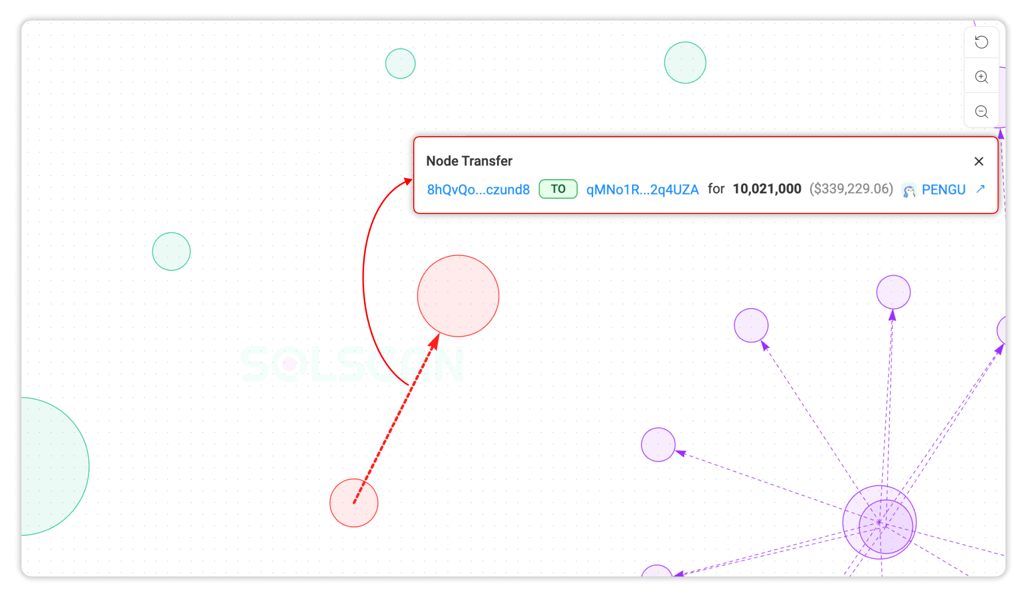
Arrow Details
Clicking on an arrow between two nodes displays the summarize transaction action, including:
- The source and destination wallets of the transaction.
- The net amount transferred between the two wallets over the selected time frame.
These interactions allow users to drill down into the context behind each transfer, helping clarify whether flows are organic, systematic, or possibly suspicious.
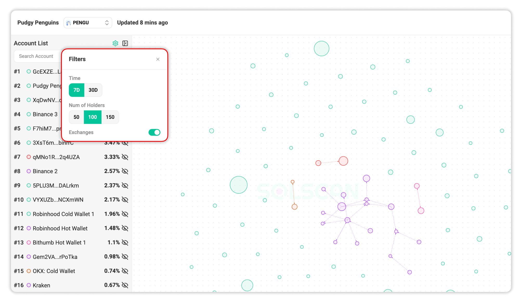
Display Settings
To keep the visualization both insightful and manageable, users can customize several display parameters:
- Time Range: View activity over the past 7 days or up to 30 days.
- Holder Count: Choose to display the top 50, 100, or 150 token holders to adjust graph complexity.
- Address Filtering: Hide large exchange addresses for a more focused view of organic holder flows.
All settings are available in the control panel at the top of the visualizer and are designed to support both quick checks and in-depth analysis.
Unique Add-On: Cross-Token Relationship Filter
A standout sub-feature of the Token Flow Visualizer is its ability to overlay a second token filter on top of the existing holder graph.
For example, you’re exploring the top holders of token PENGU. By applying the filter for USDC, you can instantly see whether PENGU holders have been transferring USDC among themselves. If they have, arrows will appear between nodes, showing the flow of USDC. Clicking on these arrows reveals full details of the transfer.
This cross-token analysis opens up new ways to understand capital movement and potential links between token ecosystems.
The token filter is located at the top left of the visualizer interface.
Final Thoughts
The Token Flow Visualizer adds a new dimension to token analytics on Solana, turning raw holder data into actionable insights. Whether you're tracking whale activity, following liquidity shifts, or exploring token interconnections, this tool provides a clearer view of how fund moves across the chain.
We invite you to try it out and share your feedback as we’re continuing to refine this feature based on real user insights.