Solscan Transfers & Defi Activities Analytics Visualization
The Analytics Visualization feature provides an interactive way to explore Solana network activity for both accounts and tokens’ transfers and Defi transactions. It automatically generates charts and summaries based on the most recent on-chain data, helping users to identify trends, patterns, and anomalies without manual data handling.
How to Access
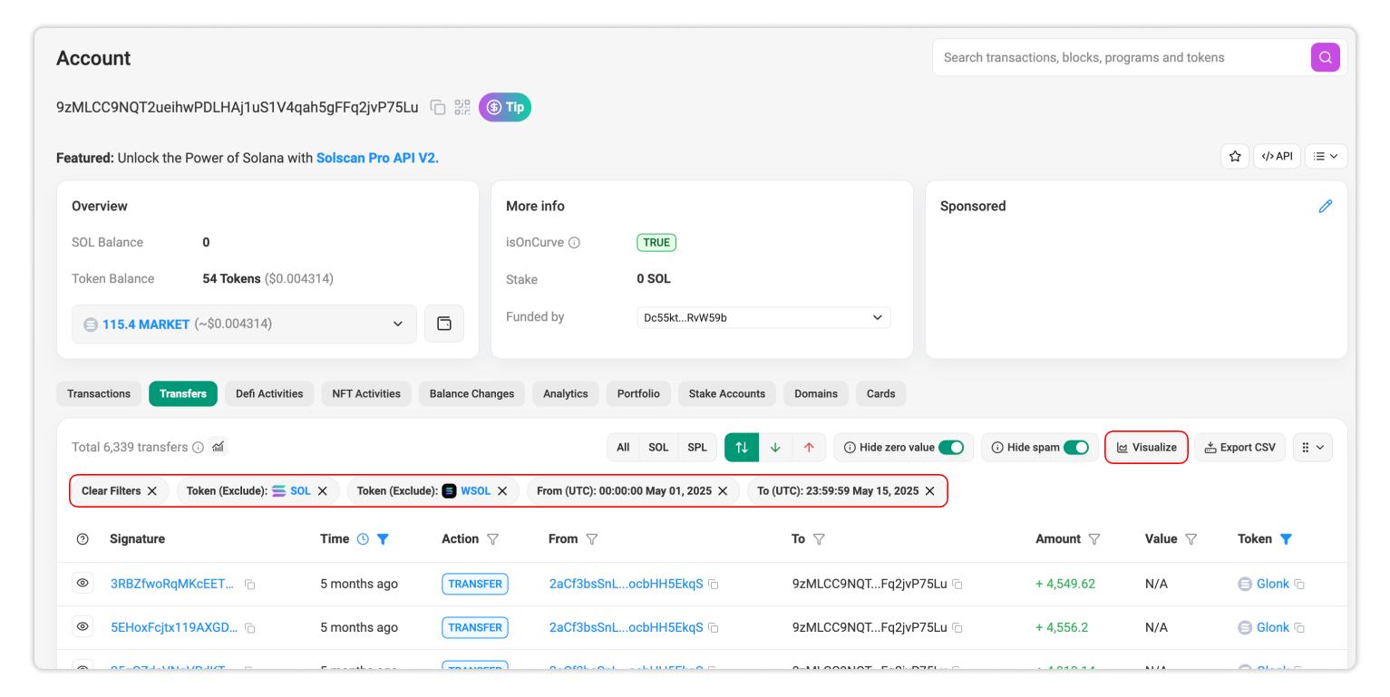
The Analytics Visualization is available for Transfers and Defi Activities transactions of an Account or Token page on Solscan.
- Open the relevant Account or Token page.
- Navigate to the Transfers or Defi Activities tab, depending on the type of activity you want to explore.
- Click the ‘Visualize’ button at the top-right of the table.
A dedicated dashboard will pop up, displaying interactive charts that reflect recent blockchain activity.
Users can hover over data points for precise values, toggle legends to show or hide specific data sets, and focus on specific patterns without having to leave the platform.
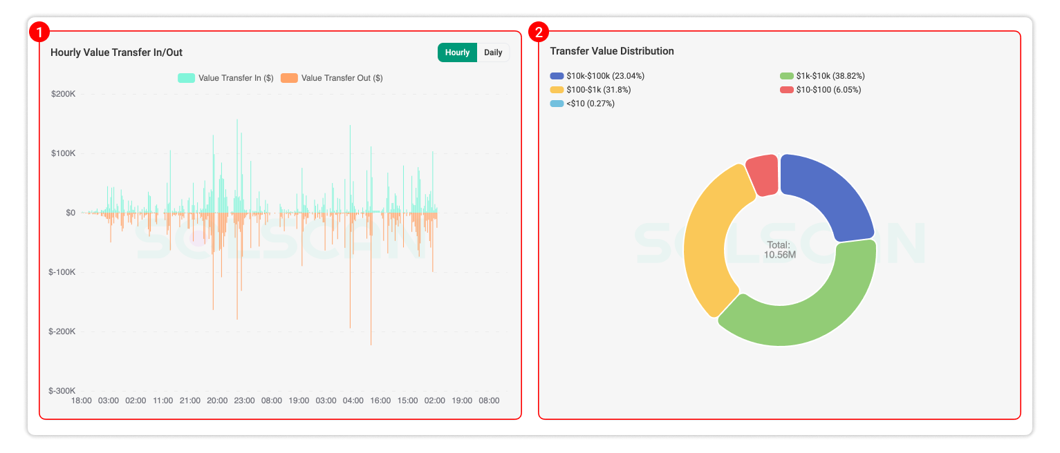
Transfers Analytics Visualizer
The Transfers Analytics Visualizer aggregates recent transfer data to reveal value movement and which participants are most active.
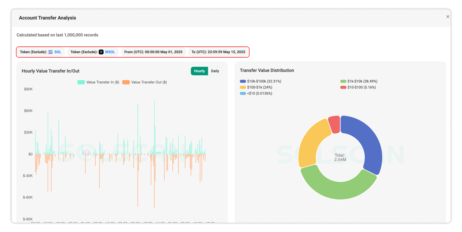
- Hourly/Daily Value Transfer In/Out – Tracks the total value of tokens transferred into and out of the selected account or the total value of the selected token transferred over time. This view helps identify peak transfer periods and spot unusual inflows or outflows.
- Transfer Value Distribution – Breaks down transfers by value range, allowing users to see the total number and volume of small transfers or a few large ones.
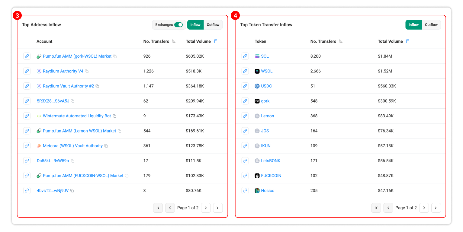
- Top Address Inflow/Outflow – Shows which addresses that the selected account or token sent the largest to (outflows), or received the largest from (inflows) by volume.
- Top Token Transfer Inflow/Outflow (only in Account page) – Shows which tokens that the selected account most frequently transferred out or received by volume.
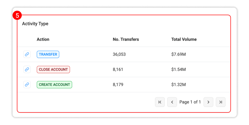
- Activity Type – Categorizes transfer events (e.g: transferring, closing/creating account, token minting/burning) that happened the most and theirs relative total volume.
Defi Activities Analytics Visualizer
The Defi Activities Analytics Visualizer focuses on on-chain Defi activities such as swapping, liquidity depositing/removing, borrowing, lending of accounts and tokens.
- Hourly/Daily Number of Activities – Tracks the number of Defi activities events over time, highlighting changes in protocol usage or trading activity.
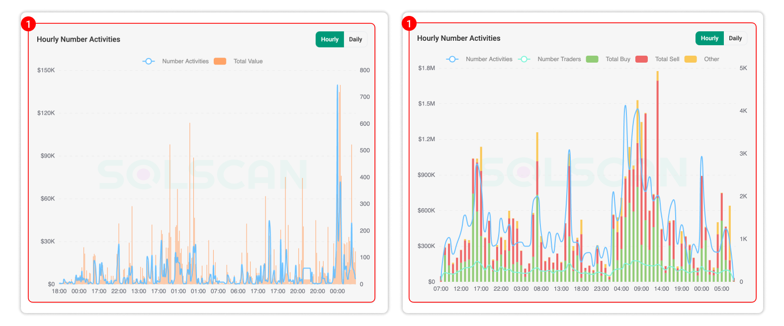
- Defi Value Distribution – Breaks down swap transactions by value range, showing whether the market is driven by high-value trades or a larger number of smaller swaps.
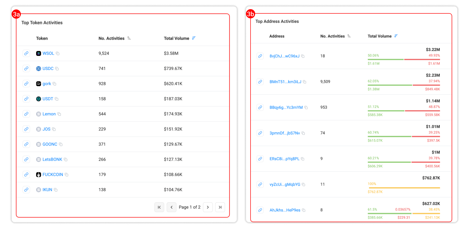
3a. Top Token Activities (only in Account page) – Shows the most frequently interacted tokens according to volume by the selected account.
3b. Top Address Activities (only in Token page) – Shows the most active addresses in Defi swaps (buys/sells/others) and the volumes involving the selected token.
- Activity Type – Categorizes Defi activities that happened the most including the number of activities and total volume.
Display Range
The analytics visualizations are generated from the most recent 1,000,000 records indexed by Solscan for the selected activity type (Transfers or Defi activities).
If the wallet or token has a longer history of transactions, you can always focus on a specific time range by applying the Time filters before clicking Visualize. You can also apply other filters if necessary for your research. This pre-filtering ensures the resulting charts display only the data most relevant to your analysis.
Example
Suppose you want to visualize all transfer transactions of a specific wallet that meet the following conditions:
- Occurred between May 1, 2025 and May 15, 2025.
- Involved SPL tokens only (excluding SOL and WSOL).
You can do this by applying the available filters before clicking Visualize:
- Use the Time filter to select the desired date range.
- In the Token filter, exclude SOL and WSOL to focus solely on SPL token transfers.
- Click 'Visualize' button to see the charts.
All feedback is welcome! Let us know what insights you would like to include in this part, as we are continuing to add more data.